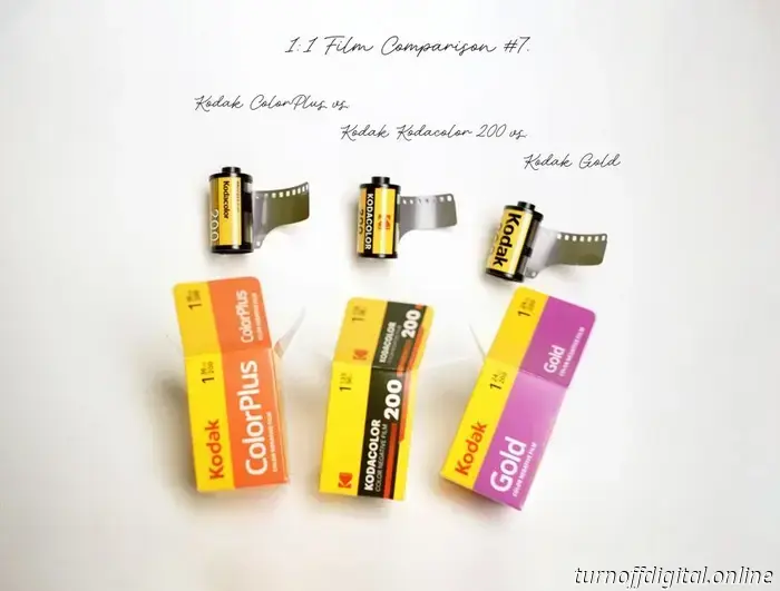
Kodak produces a substantial amount of film. When there was a demand for more medium-speed color-negative film, they responded with three options: Kodak ColorPlus, Kodak Gold, and the new Kodacolor 200. As mentioned earlier, all of these films utilize similar branding. Notably, Kodacolor 200 features a bolder font, vintage design influences, and a different Kodak logo. However, that information is not very illuminating. Ultimately, it’s what’s inside that truly counts.
Unfortunately, the film cartridges provide even less information than the packaging does. Kodak ColorPlus has “Kodacolor 200” printed on its side, just like the new film, while Kodak Gold simply states “Kodak 200.” Given Kodak's lack of clarity in distinguishing these three films, I dedicated several days to researching and conducting an experiment comparing the colors, grain, and dynamic range under various lighting conditions.
In this article: Why does Kodak offer three similar films? Guess! Overview and methods of the experiment. Answer key. Side-by-side exposure tests in the studio. Edge markings and base thickness. Side-by-side outdoor light comparison. Choose which looks better and supports Kodak more directly. Support this blog & enjoy premium features with GOLD memberships! Kodak Gold 200 with Voigtländer Vitessa A.
Why do we have three similar films from Kodak? In 2012, Kodak underwent a division following a bankruptcy, resulting in two separate companies. Eastman Kodak Company maintained its factories and divisions, while Kodak Alaris became the exclusive distributor of Kodak film to photographers. The red “Kodak” text on the film boxes signifies the Kodak Alaris logo, while the stylized red “K” represents the Eastman Kodak Company logo, unexpectedly appearing there.
It’s unclear how Eastman Kodak managed to release its own film despite Alaris having exclusive distribution rights. Regardless, Kodacolor offers a way to access Kodak film with one fewer intermediary. An earlier study indicated that Kodak Gold and ColorPlus are not entirely the same; there are notable differences in film bases and color outputs. Historically, their distribution has varied: ColorPlus was targeted for the South American and Asian markets, whereas Gold was for the rest of the world (though that may have changed recently).
So, what does this mean for consumers? Is it merely a matter of availability and branding, or do actual differences exist between the films once they are shot, developed, and scanned? Guess! Some films are easily identifiable; Kodak Aerochrome stands out for its striking false-color infrared palette. According to statistics, Film Ferrania P30 is the second most recognizable black-and-white film.
Are our three ISO 200 Kodak color-negative films distinguishable? What do you think this image was shot on: Answer below the fold.
Overview of the experiment and methods. Most film photographers understand that processing and scanning can greatly affect the film's appearance before editing starts. Not controlling these factors can lead to inconclusive or misleading comparisons. In a previous experiment comparing Kodak Gold and Kodak ColorPlus (excluding Kodacolor), we developed both films using the same Paterson tank and scanned them twice: first with a DSLR and then with a dedicated film scanner. Daren inverted his DSLR scans with Negative Lab Pro, while I used the film Q app to invert negatives without altering their qualities.
Our findings contrasted with top articles, videos, and AI responses that ascribed a “vintage” appearance to ColorPlus and a “modern” look to Gold, without explaining the process or providing adequate proof. Misleading assumptions can stem from simple factors such as packaging design, marketing materials, pricing, and the presets labs use for film processing, along with film inversion software profiles that often can’t be adjusted.
I've aimed to counter these biases and produce a series of reproducible, reliable reference images in this experiment. Here’s the plan: Project notes. The top-left shows a sketch of the scene plan, while the rest contains exposure and film frame indexes to ensure I exposed three films with two cameras in exactly the same manner.
Experiment setup, tools, and process: I used two Voigtländer Vitess A cameras equipped with the same Ultron 2.0 lens. Since I was working with three films, I made sure Kodak Gold was 24 exposures, allowing for a 12-frame overlap to shoot the exact same scene across three different films. Although a single camera with interchangeable film backs on a tripod might seem like a more effective solution, practical issues like live subjects, lighting, wind, and even the film's position inside the camera can alter results frame by frame, compromising the effort and limitations of a static setup. Fortunately, none of these factors significantly impeded accurate evaluations.
I established a static, studio-lit scene featuring a self-portrait for most of the experiment. I intended to create several heavily bracketed exposures for each film and select the most representative images. Finally, I took my cameras outdoors with two
Kodak sells a significant amount of film. In response to the demand for more medium-speed colour-negative film, they introduced three options: Kodak ColorPlus, Kodak Gold, and the newly released Kodacolor 200. However, since they haven't effectively clarified the differences (if any) between these three films, I dedicated several days to researching and organizing an experiment to compare their colours, grain, and dynamic range in different lighting situations.